Apple’s Bold Design Choice of Making Things Look Bad
Introduction Link to heading
Apple enjoys a unique position in the mobile business. It manages a platform that runs on an exclusive range of devices. For developers, this means they can expect their app to run similarly to how it runs on their own devices.
This allows Apple to make design choices that make ’things look bad’ and reasonably expect developers to make the necessary changes so their apps look good on Apple devices.
Case 1: The Notch Link to heading
The notch is essentially a visual modification to the already existing status bar. And the status bar is part of the system interface, not the app interface.
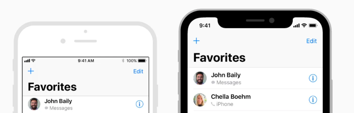
Android’s solution to optimizing app interfaces for notched displays was exactly this. They treated the notch area as the status bar. The app didn’t have to be bothered by it; it continued to work as before.
iOS, on the other hand, added huge black areas on the top and bottom for apps that didn’t claim to be optimized. This effectively reduced the app interface’s real estate to 4.7” on a 5.8” screen.
In hindsight, this paid off. Nearly all iOS apps started working well on screens with display cutouts very soon.
Case 2: Tinted Icons Link to heading
This is again something both iOS and Android did. But Android is far more lenient with its approach, using the default icon as a fallback if a tinted icon doesn’t exist in the manifest.
iOS again doesn’t use a fallback, instead choosing to make the icon look potentially bad by applying a tint over it.
This attracted a lot of initial criticism but is very much in line with how Apple does things. The onus falls on app developers to make their apps fit into this system