Introduction
World Cup logos are a visual representation of the time, culture and the general vibe of the host nation and the time period in which it is held. There are three major world cups that happen. In order of popularity, they are:
- FIFA World Cup
- ICC Cricket World Cup
- Rugby World Cup
Nearly all world cup logos look reasonably bad or illegible in dark mode. So this page is better read in light mode
The Actual Cups
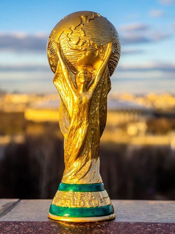 |
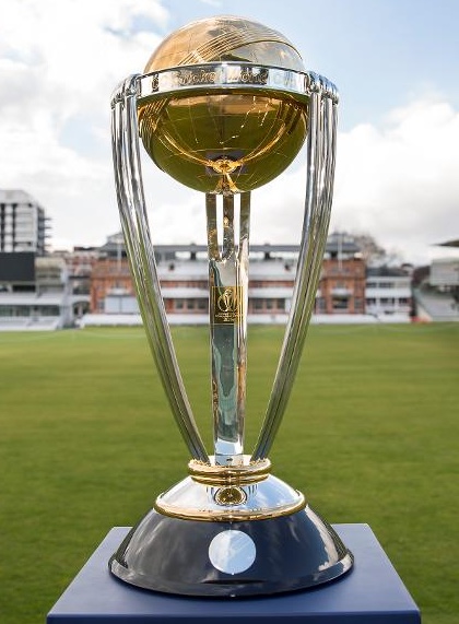 |
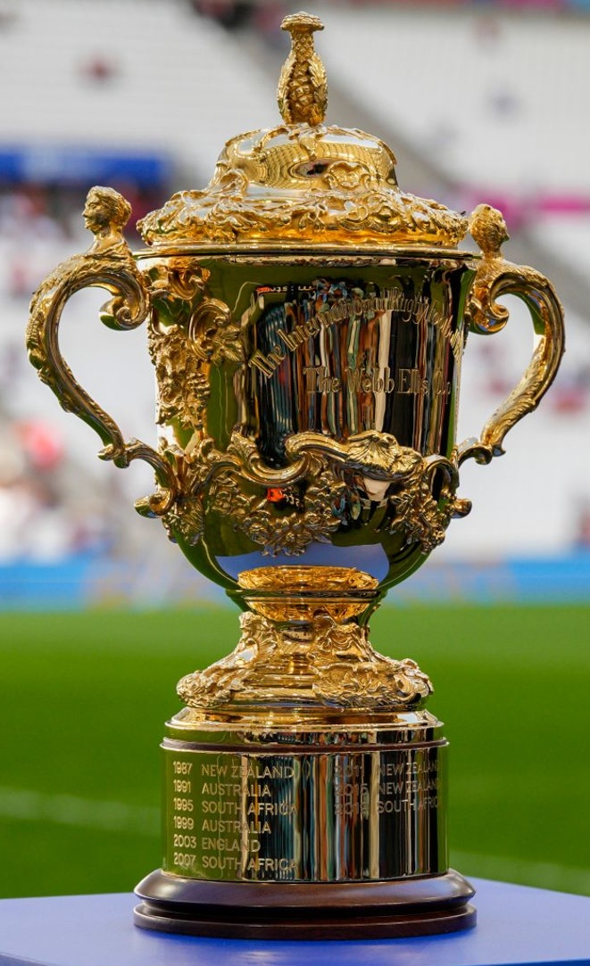 |
Logos before 2014
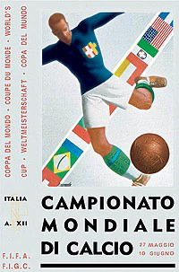
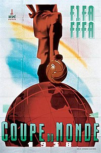
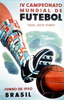
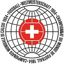
FIFA World Cup started in 1930. It did not have a logo for a long time, rather a poster existed. Cricket World Cup debuted in 1975 and the Rugby World Cup in 1987.
Poster Era (1930-1966)
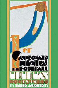
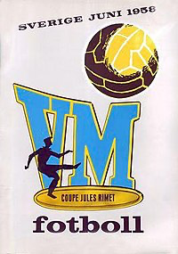
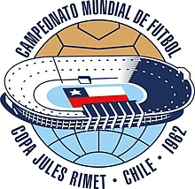
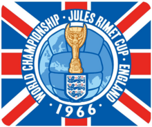
Logo Era

This is probably what can be considered the first logo
 |
 |
 |
 |
 |
 |
 |
 |
 |
 |
 |
 |
 |
 |
 |
 |
 |
 |
 |
 |
 |
 |
 |
 |
 |
 |
 |
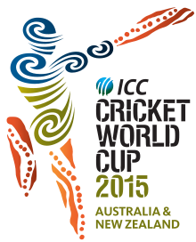
The last of Freeform logos
 |
 |
 |
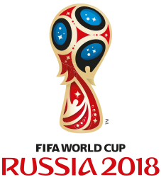
FIFA seems to have set on the logo format back in 2014. But it definitely took a better shape in 2018 and 2022. ICC had nothing resembling the cup, while the Rugby World Cup had no specific World Cup Logo before 2019.
The first logos to strictly follow the format
 |
 |
 |
Latest Logos
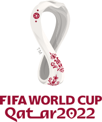
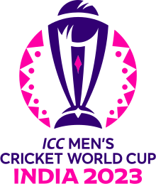
The latest FIFA World Cup happened in 2022, ICC Cricket World Cup and the Rugby World Cup in 2023. The hosts were Qatar, India and France respectively.
 |
 |
 |
Seems to be the case that all major World Cups are going for a format onto which host nations can apply their visual pattern. This behaviour is relatively new and started with these World Cups during the 2018-19 time period. Looking at the previous logos
Putting these together
Rugby has a similar visual identity that still allows for freedom across their various world cups. With 6 logos following the visual pattern, they’re clearly ahead
Rugby
 |
 |
 |
 |
 |
 |
Cricket
 |
 |
 |
Football
 |
 |
 |
Bonus: T20 Cricket World Cup
The T20 World Cup logos from 2007 to 2012 saw host nations having to write the word T20 in their choice of design
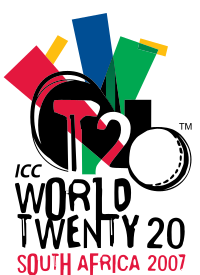 |
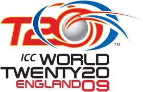 |
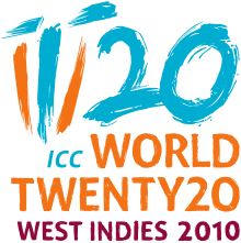 |
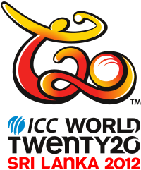 |
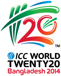 |
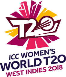
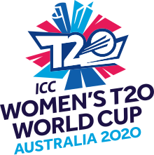
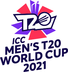
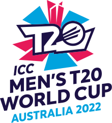
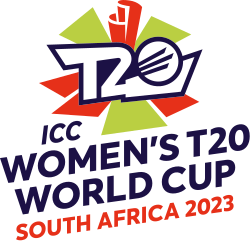
This changed in 2014 and ICC decided on a more restrictive format where you could only change the colours
 |
 |
 |
 |
 |
 |